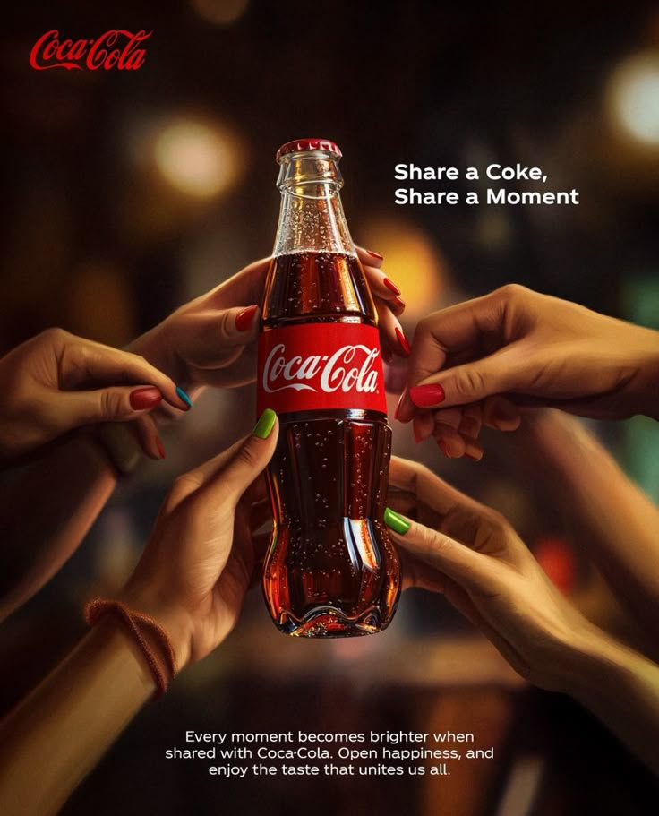
Alright, so today I’m gonna share how I messed around with some art based on Coca-Cola’s iconic design. It was a fun little project, and I learned a thing or two along the way.
First things first, inspiration hit me outta nowhere. I was chugging a Coke (don’t judge), and I thought, "Hey, that's a pretty recognizable design. What if I tried to make something kinda artsy with it?" So, I grabbed my sketchbook and started brainstorming.
I didn't want to just copy the label, that's boring. I wanted to twist it, add my own flavor. I looked at some Warhol stuff for inspo, that pop art vibe. Then, I started sketching.

Next up, the digital dive. I decided to use Procreate on my iPad. Figured it’d be easier to play around with colors and layers. I imported a picture of a Coke bottle as a reference. Traced the basic shape, then started messing with the colors. Switched from the classic red to some crazy neon stuff.
Then came the experimentation. I tried a bunch of different things. Splatter effects, geometric shapes, even threw in some random textures I found online. It was a bit chaotic at first, looked like a toddler went wild with a digital paintbrush. But I kept at it. Added some gritty textures for a vintage feel.
I hit a wall. It wasn't looking as cool as I envisioned. The colors were clashing, the composition was off. I almost scrapped the whole thing. But I took a break, stepped away from the iPad. Came back with fresh eyes and deleted half of what I had done. Sometimes less is more, ya know?
Fine-tuning time. I simplified the design, focused on the contrast. Used the original Coke logo as a focal point, then built around it with the abstract elements. Played with the blending modes in Procreate to get some interesting effects. A little bit of Gaussian blur here, a dash of overlay there. You get the picture.
Finally, the reveal. After a few hours of tweaking and fiddling, I was actually pretty happy with the result. It wasn't a masterpiece, but it was a fun, kinda funky take on a classic design. I posted it on my Insta, got some decent feedback. Might even print it out and hang it up in my room.

- Learned that even iconic designs can be twisted and played with.
- Don’t be afraid to experiment, even if it looks like a hot mess at first.
- Taking a break when you're stuck can make all the difference.
Would I do it again? Definitely. It was a good creative exercise, and I got to play around with some new techniques. Maybe next time I’ll try a different iconic brand. Hmm, what about a Big Mac?


