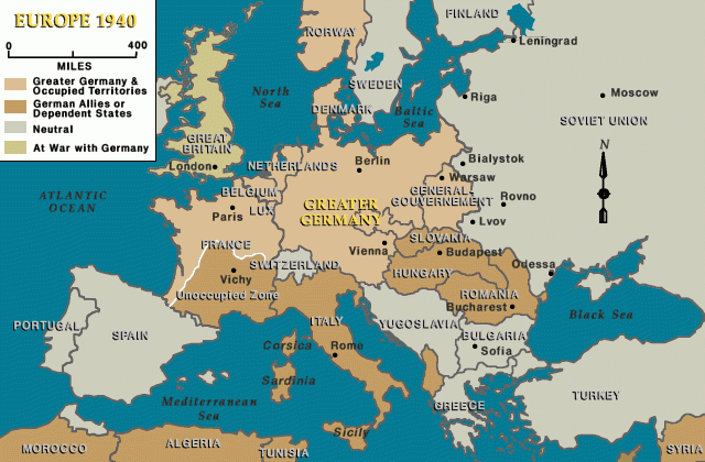
Hey everyone. Been meaning to share this little project I wrapped up recently. I decided to create a map of Europe as it looked around 1940. You know, that pivotal year. I've always been fascinated by that period, and visually laying it out helps me understand things better.
Getting the Ball Rolling
So, the first thing I did was to gather some references. I figured I needed a solid base to work from. I spent a good afternoon just digging through online archives, looking at old maps, and cross-referencing historical accounts. It’s kinda tricky, 'cause borders were shifting so fast back then, and different sources sometimes show slightly different things. I wasn't aiming for academic perfection, just a good representation for a hobbyist like me. I eventually found a few decent outline maps that showed the general coastlines and country shapes from around that time. That was my starting point.
The Actual Making Of It
Once I had my references, I got down to the actual map-making. I decided to do it all digitally. I’m pretty comfortable with a basic graphics program I have – nothing fancy, just your standard raster and vector stuff. It’s just easier to tweak things and correct mistakes that way, you know? I started by tracing the main national boundaries. This took a while, especially for Central and Eastern Europe. So many changes there. I had to redraw a few areas several times to get them looking reasonably accurate according to my sources for 1940. I'd zoom in, adjust a line, zoom out, check it, then do it all over again. Patience is key, I tell ya.
I focused on getting the major players right: Germany and its expansions, the Soviet Union, the UK, France, Italy, and so on. Also wanted to make sure I represented countries like Poland, which had a very rough time, or the Baltic states. It involved a lot of looking back and forth between my references and my screen.
Adding the Details and Colors
With the main borders in place, I moved on to adding some detail. I didn't want to clutter it up too much. My goal was a clear, readable map. So, I added labels for the countries and some of the major cities. Choosing fonts was a small thing, but I tried to pick something that felt a bit classic, not too modern.
Then came coloring. I tried to pick a color scheme that felt somewhat period-appropriate, or at least not jarringly modern. Went for more muted tones for the countries. I also thought about how to represent areas under occupation or influence. For example, I made sure to show how Germany had expanded by that point, and the areas affected by the Molotov-Ribbentrop Pact. This meant more checking of historical details for that specific year. I'm talking about things like the Government General in Poland, the Protectorate of Bohemia and Moravia, that sort of thing. It's important to get those as right as you can.
Final Thoughts on the Process
It was quite a bit of work, more than I initially thought, to be honest. Just piecing together all that information and trying to display it clearly. There were moments of frustration, especially when lines just wouldn't look right, or when I found conflicting information about a specific border detail for 1940.
But overall, I'm pretty happy with how it turned out. It’s not a professional cartographer's masterpiece, far from it. But for me, it was a great learning exercise. It really helped me visualize the situation in Europe at that critical juncture. And there's something satisfying about starting with a blank canvas and ending up with a complete map that you've researched and drawn yourself. Just wanted to share my little journey with this one. Maybe it inspires someone to pick up a similar project!