Today was wild, I actually tried something I'd been thinking about for ages – comparing Paul Cezanne's paintings side-by-side with the actual landscapes he painted. You know how his stuff looks weirdly chunky and geometric? Yeah, wanted to see exactly how much he changed reality. Here’s how it went down.
First up, needed material. Spent ages scrolling online, hunting for decent photos of the Mont Sainte-Victoire area around Aix-en-Provence. Cezanne painted it like, a million times. Found a few good ones showing different angles and seasons. Printed those suckers out. Then, tracked down high-quality images of several of his actual paintings featuring that mountain. Bookmarked them on the tablet. Real views vs. Cezanne's versions… ready to rumble.
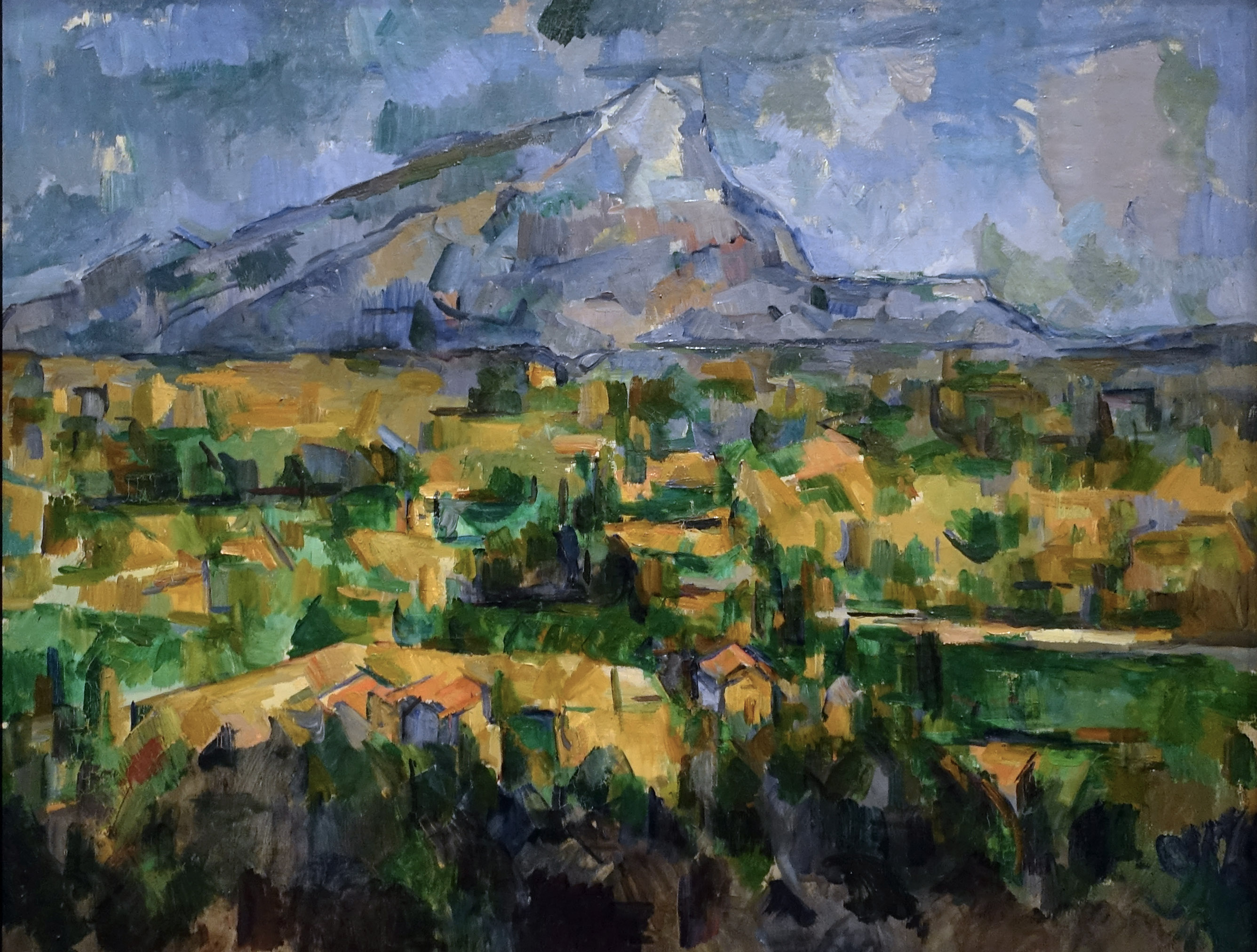
Took over the dining table. No fancy setups here. Tablet propped up showing a Cezanne, printed photo of roughly the same view placed next to it. Grabbed my coffee, plopped down, and just stared. Started simple: the basic outline. Okay, mountain shape? Similar enough, recognizable. But then… everything else?
The Weird Stuff Jumped Out
- The Scale Shuffle: Trees in the foreground? In his paintings, they often feel massive compared to the mountain behind them. Like, unrealistically huge guardians. Looking at the photos? Nah, they're just regular trees. He deliberately pumped them up!
- Perspective? What Perspective? This blew my mind. Real photos have clear depth – stuff gets smaller, hazier, bluer as it goes back. Cezanne? He flattens everything. The fields in the midground, the mountain itself – they all seem pushed forward, stacked almost like blocks. Looked at that painted mountain edge next to the faded, distant one in the photo… felt like he just cut out the atmosphere with scissors.
- Color Schemes from Mars: This was the real kicker. Those famously green Provence fields? In Cezanne's world, they morph into bold stripes of orange, yellow, sometimes even purple. Shadows weren't just grey or blue; they pulsed with pure ultramarine or deep greens. Held up the photo – greens, browns, blues. Held up Cezanne – a whole different color planet. He wasn't copying sunlight; he was inventing his own light source.
- Geometric Reality: Stared hard at a cloud in a photo. Soft, fluffy, drifting. Glanced at Cezanne's version. Bam. Often just a simplified, solid teardrop shape. Or a tree – in reality, messy branches. In the painting? Broken down into basic cylinders and cones. Like he saw underneath the surface chaos to the simple forms.
Tried sketching a bit myself, right there at the table. Grabbed a pencil, looked at the photo, tried to draw what I saw – typical messy hillside. Then tried forcing my brain to see it like Cezanne – simplifying trees into cylinders, ignoring fading distance, pushing fields into flat planes of imagined color. It felt weird, unnatural at first. Like learning a new language.
So what's the big takeaway from this kitchen-table experiment? Cezanne wasn't painting the view. At least, not the one anyone with a camera could capture. He was painting his understanding of the structures – the hidden cubes, spheres, and cones that make up the world. He traded realistic scale and depth for solid, rhythmic composition. He swapped natural colors for emotional and structural ones – a green field isn't green, it’s part of a visual melody. It hit me: his "artistic difference" was fundamental. He wasn't recording light on a mountain; he was using the mountain to build something entirely new out of paint, something about permanence and structure hidden beneath the shifting surface. Makes you look at reality, and his wild paintings, completely differently. Totally worth the coffee stains on the printouts.


