So, I got this bug in my ear a while back – I wanted to try my hand at creating some Byzantine Jesus art. You see it around, right? In pictures, museums, sometimes even modern takes. I thought, "Yeah, I could probably do something like that." Seemed like a cool challenge, something different from my usual stuff.
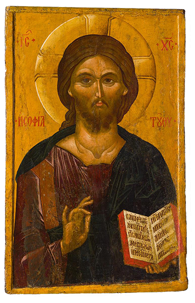
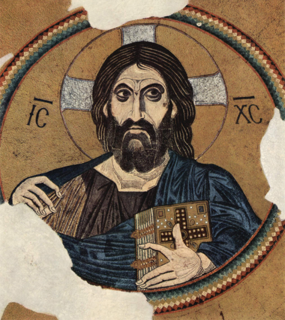
First off, I dived into looking at examples. Loads of them. Online, in books I could find. You know the style – those very formal figures, the big, staring eyes, often elongated faces, and of course, the gold. Always with the gold backgrounds. My first impression? "Okay, seems kinda formulaic. Shouldn't be too hard to replicate the vibe." That was me being a bit naive, as usual.
Then I actually started to sketch. And boy, was that a wake-up call. My first attempts? They just looked… wrong. Like a weird cartoon. Getting those specific proportions, the way the robes drape, the very particular way faces are structured – it’s not just "draw a person." I spent a good while just trying to get the lines to feel right, to capture that specific solemn, almost otherworldly look. It’s flatter than what I’m used to, less about realistic depth and more about symbolic representation.
Getting the Look and Feel
Then came the color. I knew gold was key. At first, I tried some gold acrylic paint. It was… okay. But it didn’t have that luminous quality you see in the real deal. It just looked like, well, gold paint. I even briefly considered looking into gold leaf, but then I read up on it and thought, "Whoa, that's a whole other skill set, and probably a messy one too!" So, I stuck with trying to make the paint work, layering it, trying to get a bit of texture.
The other colors are pretty specific too, lots of deep blues, reds, ochres. I tried to stick to that traditional palette. It’s not about flashy, bright modern colors. It’s all very earthy and rich. And blending? Not so much. It's more about distinct areas of color, often with strong outlines. That was another thing I had to consciously work on, breaking my usual habits.
And it's "Jesus" art, right? So, there’s an inherent weight to it. I wasn't just drawing a random figure; I was trying to capture something iconic. The expression is key – that calm, knowing, slightly sorrowful gaze. That was tough. I did a few versions of the face alone before I felt I was even close to something that didn't look completely off.
One of the biggest hurdles for me was the halos. Getting them perfectly circular and to sit right behind the head, making them look like they're glowing rather than just stuck on. I fussed with those quite a bit.
What I Figured Out
Honestly, I went through a few iterations. My first complete piece? I looked at it and thought, "Nah, that's not quite it." The posture felt wrong, or the eyes weren't right. So, I'd start over or repaint sections. It’s a lot more than just following a set of visual rules; you have to kind of feel it. The whole process made me appreciate the skill of those original artists way more. It looks simple from a distance, but there's a real depth and a very specific aesthetic language going on.
In the end, I got something I was reasonably happy with. Is it a masterpiece that'll hang in a church? Definitely not. But I learned a ton. About the style, sure, but also about patience and about how much thought goes into art that might, at first glance, seem restrictive or overly simple. It's a very deliberate art form. You're not just splashing paint; every element usually means something. I spent a lot of time just looking and absorbing before I could even make a decent mark. So yeah, that was my little adventure into Byzantine art. It was definitely a trip.


