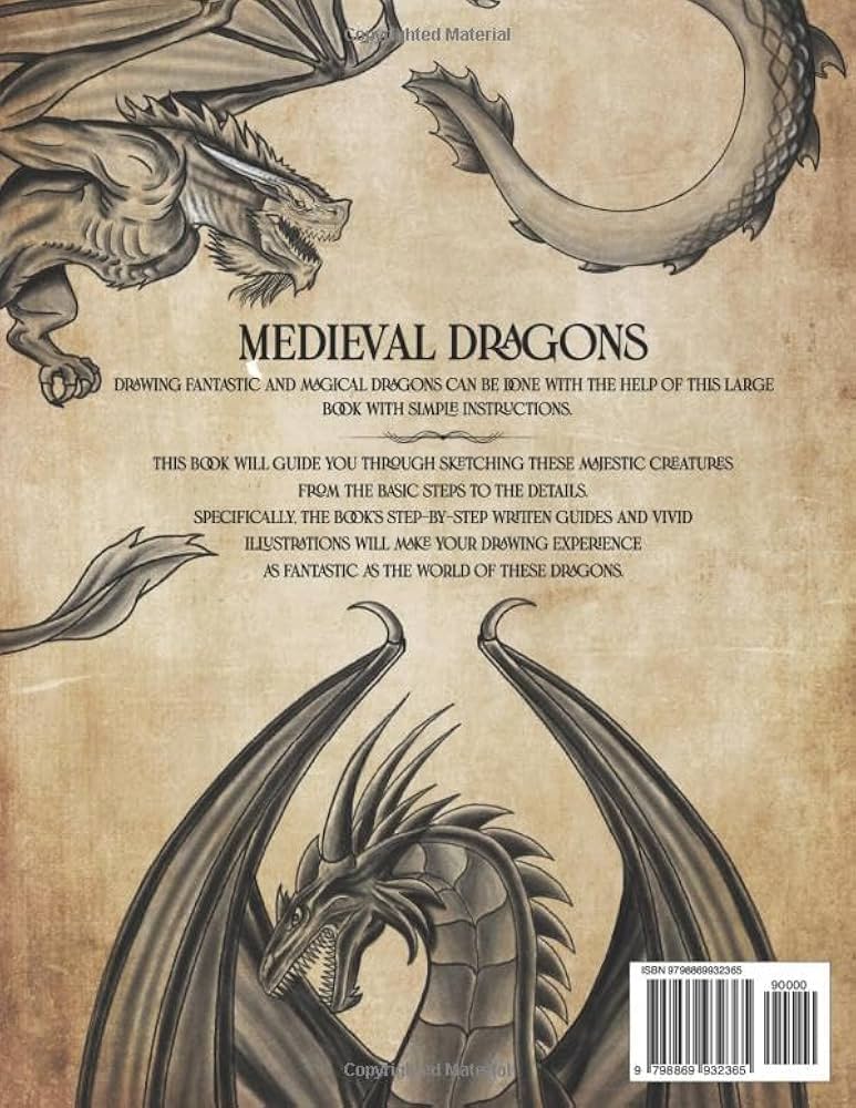
Alright, so I decided to try my hand at some medieval dragon artwork the other day. Thought it'd be pretty straightforward, you know? Dragons are cool, medieval stuff is cool. Put 'em together. Boom.
But man, it wasn't that simple. My first few tries? They just looked like generic fantasy dragons. You know, the kind you see on every video game cover. Sleek, super detailed, probably breathing ridiculously perfect fire. That wasn't what I was going for. I wanted that old, kinda clunky, manuscript vibe. The kind of dragon that looks like it was drawn by a monk who'd maybe heard stories about dragons but never actually, you know, seen one.
Getting that old feel is tricky
I started messing around with my usual digital art software. Got all my fancy brushes out. And that was the first problem. Everything was too clean. Too perfect. Medieval art, especially the stuff in old books, it’s got a roughness to it. You can almost feel the quill scratching on the parchment. My digital lines were just too smooth, too sterile.

And the anatomy! Modern fantasy dragons are all, like, hyper-realistic, if a mythical creature can be realistic. But medieval dragons? Sometimes their wings are too small, or their necks are weirdly long, or they've got goofy expressions. It’s more about symbolism than perfect biology. Trying to get that balance between "looks like a dragon" and "looks like an old drawing of a dragon" was a real head-scratcher.
I spent a good while just staring at my screen, thinking, "This ain't it." My dragons looked like they belonged on a heavy metal album cover, not in a dusty old tome.
What I ended up doing
So, I had to kinda rethink my whole approach. Here’s what I tried:
- Looking at actual references: I mean, duh, right? But I went deep. Not just the famous, fancy illuminated manuscripts, but also the simpler, more rustic drawings. The ones with weird proportions. That helped a lot to get the "feel."
- Limiting my tools: I ditched most of my fancy digital brushes. Tried to stick to simpler tools, things that mimicked a basic pen or a rough brush. Forced myself to be less precise.
- Texture, texture, texture: This was a big one. I started playing with background textures to make it look like old paper or parchment. Even tried to add some imperfections to the dragon itself, like the ink bled a little here and there.
- Color palette: Modern digital art can have millions of colors. Medieval artists? They had a much more limited set of pigments. So, I tried to stick to more muted, earthy tones, with maybe a few bold, flat colors for emphasis. Less blending, more blocky colors.
It was a lot of trial and error. Lots of deleting layers and starting over. At one point, I almost gave up and just drew a stick figure dragon. Would've been easier, that’s for sure.
Eventually, I started to get something that felt a bit more authentic. It wasn’t perfect, not by a long shot. But it had that slightly awkward, charming quality I was looking for. It looked less like a terrifying beast and more like something out of an old legend, told around a fire.

Why bother with all this?
You might be wondering why I put myself through all this for a dragon drawing. Well, my nephew's birthday was coming up. He’s obsessed with knights, castles, all that medieval jazz. I wanted to make him a unique card, something special. And I figured, what’s more medieval than a dragon?
But all the stock images and clip art just felt so… bland. Or too polished. I wanted something with a bit more character, something that felt like it had a story. So, yeah, that’s why I spent a weekend battling digital quills and wrestling with imaginary parchment. All for a kid's birthday card. He loved it, by the way. Said it was the coolest dragon ever. Kids, huh? They don't care if the anatomy is perfect, as long as it looks awesome to them.
And honestly, it was a fun challenge. Made me appreciate the old ways of making art a bit more. Sometimes, less is more, you know?


